We decided to post the music video onto a couple of forums, asking for their opinions on the video. The image below shows the result from the website, www.HaloReachForum.eu, which despite being a Gaming Website - does hold some valuable opinions. The typical member on the site is of around 18 years old, and generally speaking comes under the ABC1 category, which is exactly what we were aiming to target. In addition, the Halo scene has developed its own cult in movie production, with many people deciding to create 'gaming montages'. By having these editors' opinions, we are able to gain some valuable opinions on our video.
Please click to enlarge.
As you can see, the actual Poll results show some very successful outcomes. The video was generally speaking taken on board extremely well, and only a minor few disliked the video. Whilst the video didn't 100% result in people wanting to buy the song, that could be because of one of the following reasons:
A) Buy songs
B) Like the song itself
C) Already have the song
Furthermore, the result and popuality of the video could have resulted in it spreading (by them showing friends etc.) This could have ultimately resulted in more people viewing the video, and the potential sale of the song also increasing.
Three responses from the thread:
Thursday, 16 December 2010
Tuesday, 14 December 2010
Sunday, 12 December 2010
Ancillary Texts - Magazine Poster (Tour Dates) and The Design Process
The Tour Dates Poster consists of features relating both to the CD design, and also the music video. For instance, the Poster contains a background filled with stars - this relates to the CD's Front and Back Cover. Furthermore, the Front and Back Cover are displayed on the Final Version of the Poster. This allows us to advertise multiple products for the band. In addition, the images of the band used were also used in the music video: this is our attempt at connecting the two products together.
To see the design features - look below:
Band Images Used:
Original Magazine Idea:
Tour Dates Poster
We decided on using this poster rather than the other one for a few main reasons. The first one is that it contains all the band members from the music video whilst the previous one only contains three out of the four. The second reason is that it contains the images we used for the front and the back of the cd cover, because of this it reminds people that there is also a CD so that they might consider going and buying it as well as making it a package rather than just three separate pieces of media. The final reason is that we believe that the layout and overall design is a lot nicer than the other one.
In addition, we've decided to add Social Networking sites to the poster. This way we're able to direct fans to one website for constant updates. Furthermore, we could potentially gain more fans, as they might look at the website's and decide they like the music or personality of the band.
Ancillary Texts - CD Inside Spread (Double Page Spread) and The Design Process
Inside Double Page
Whilst this may look very simplistic at first - we spent a long time searching through our photographs trying to decide the right images. We wanted to use photographs that were used in the music video, so that the video and artwork related definitely in some way. The black background also relates to the space theme we've used throughout the ancillary texts. The design features can be seen below.
Please Note: This is an Inside Spread which would be within the booklet of the CD artwork.
Guitar Edit:
Bass Edit:
Drums Edit:
Vocals Edit:
Final Image:
Ancillary Texts - CD Back Cover and The Design Process
Fortunately, the Back Cover didn't require as many programs - however, the actual design took far longer than expected. The amount of layers in this one and the edit to each layer far surpasses that of the Front Cover. Everything designed on the Back Cover was created in Photoshop (apart from the barcode and RHCP logo) - unlike the Front Cover, which used a photograph of clouds and the monkey image (manipulated however).
Back Cover Design:
The Back Cover
Back Cover Design:
The Back Cover
Ancillary Texts - CD Front Cover and The Design Process
CD Front Cover
The CD Front Cover contains multiple different processes. This is why there's plenty of screenshots, and why there's different programs involved. The screenshots shown below begin from the beginning features, up until the final product. To see the image in a bigger resolution, just click on it and it should direct you to a new tab.
The two images used and manipulated:
The Monkey Design:
The Space Background:
Final Cover Design:
Friday, 10 December 2010
Monday, 29 November 2010
Evaluation Q1
In this part of the evaluation, I will be answering the question:
"How did you use media technologies in the construction and research, planning and evaluation stages?"
We used a lot of different aspects of technology to create our entire portfolio of work. To record the construction, research, planning and evaluation we decided to create a blog on the internet from the website 'Blogger.com'. For the research stage, we collected the majority of our information from the internet. We used copious amounts of websites to collect and analyse information. The best example for this would be www.youtube.com. This was our most visited website during the research stage as it allowed us to watch past music videos of The Red Hot Chili Peppers and various other genres of music to try and create information that we could use into the creation of our music video. The reason we used Youtube was because it would save us a lot of time and money, as we wouldn’t have to go out and buy the music videos we wanted to use. In addition, because we could easily embed them onto our blog - allowing us to quickly re-watch them. We also used the internet to look at The Red Hot Chili Peppers website and to look at their album covers. This made it much easier as were able to find patterns or any similarities to base our album cover on.
For the planning stage of our portfolio, we decided to use a storyboard software called "Storyboard Quick 6". This allowed us to quickly set out our idea into pictures and we used this as the basis of our more detailed storyboards. To create the storyboard we used a piece of paper and pencil - as these would be coming with us each time we film so that we remember to film everything.
The construction stage is the most heavily based on media technology, as to film the footage for the music video we used:
• Xm2 Camera
• Tripod
• Green Screen
• Studio Lights
• Canon eos 50D Camera
We used the Xm2 camera and tripod to film the monkey chase scenes. In addition, we used a tripod so that we could get a smooth panning shot when filming. Furthermore, we didn’t use the tripod for some shots like the first person point of view shots - this created the feeling of being chased; or chasing someone else. We used the green screen, studio lights, and Canon eos 50D Camera to create the shot motion for the performance element of the music video. We set up the green screen and got the actors to stand in front of it, so that we could easily edit out the background and adjust the lighting accordingly. We took multiple photos of them from different camera angles, so that we could put these together and create the stop motion from different perspectives. This stopped the video from having repetitive and bland camera angles. We used a few different pieces of software to edit the music video:
• Adobe Photoshop
• Adobe Bridge
• Adobe Premiere Pro
We used Adobe Photoshop to edit every photo, and changed it from the green screen background to a black background. Whilst doing this we also adjusted the contrast of the photos - so that the shadows were harsher and the scene itself was darker. The reason we used a green screen is because it makes it easier to cut out the green background from the foreground. We used Adobe Bridge as we could change the settings of the one photo we edited, in Photoshop, and then apply this to the rest of the photos (without having to go into each individual photo). Once we had all the footage, we used Adobe Premier Pro to edit the footage so that it was synced and in time with the music. Premiere Pro was the best editing program (in our opinion), as we could edit the shots in Photoshop, and then transfer them easily from one Adobe software to the other. This made collecting and transferring images from program to program much quicker and efficient.
For the evaluation, we are going to use Microsoft Powerpoint to create slideshows, to show what techniques we have used for the music video, single cover, and the tour dates poster. We will also do an interview for one part of the evaluation as an 'Extra' to the music video. To collect the feedback from the audience we will create questionnaires, and show the music video from a projector and ask for their opinions.
The rest of the evaluation will be posted as a video and as a slideshow presentation.
Performance Section Storyboards
Wednesday, 17 November 2010
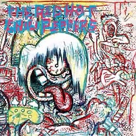
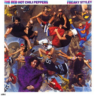
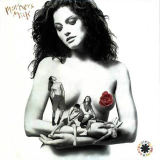
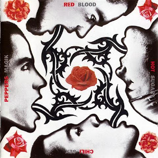
RHCP Album Covers
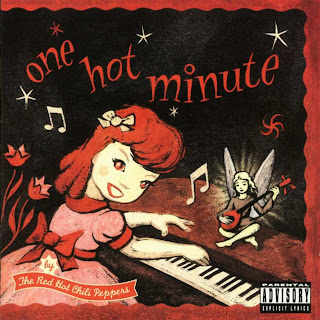
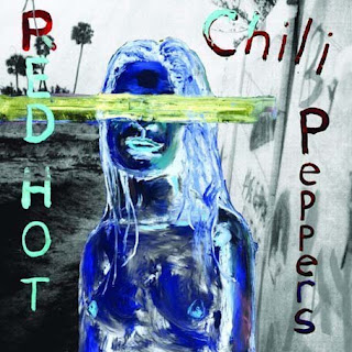
Looking through the album covers by the Red Hot Chili Peppers, you can see that they have changed from Rock and Roll to a bit more into the Pop genre. We thought about having the actors who played the Red Hot Chili Peppers in the music video on the cover but when we looked at past covers we realised that they only included the band on the front cover around 50% of the time, and since on the album that the song “Charlie” comes from didn’t have the band on it we decided to keep it that way and not add the band onto the cover. We discussed it and we all thought that the new album from The Red Hot Chili Peppers had a completely different look and feel to it. Since the song “Charlie” comes from their latest album “Stadium Arcadium” and the Stadium Arcadium album is based around a space theme we have come to a conclusion to carry on this theme onto the single CD cover for the song.
Subscribe to:
Posts (Atom)