In this part of the evaluation, I will be answering the question:
"How did you use media technologies in the construction and research, planning and evaluation stages?"
We used a lot of different aspects of technology to create our entire portfolio of work. To record the construction, research, planning and evaluation we decided to create a blog on the internet from the website 'Blogger.com'. For the research stage, we collected the majority of our information from the internet. We used copious amounts of websites to collect and analyse information. The best example for this would be www.youtube.com. This was our most visited website during the research stage as it allowed us to watch past music videos of The Red Hot Chili Peppers and various other genres of music to try and create information that we could use into the creation of our music video. The reason we used Youtube was because it would save us a lot of time and money, as we wouldn’t have to go out and buy the music videos we wanted to use. In addition, because we could easily embed them onto our blog - allowing us to quickly re-watch them. We also used the internet to look at The Red Hot Chili Peppers website and to look at their album covers. This made it much easier as were able to find patterns or any similarities to base our album cover on.
For the planning stage of our portfolio, we decided to use a storyboard software called "Storyboard Quick 6". This allowed us to quickly set out our idea into pictures and we used this as the basis of our more detailed storyboards. To create the storyboard we used a piece of paper and pencil - as these would be coming with us each time we film so that we remember to film everything.
The construction stage is the most heavily based on media technology, as to film the footage for the music video we used:
• Xm2 Camera
• Tripod
• Green Screen
• Studio Lights
• Canon eos 50D Camera
We used the Xm2 camera and tripod to film the monkey chase scenes. In addition, we used a tripod so that we could get a smooth panning shot when filming. Furthermore, we didn’t use the tripod for some shots like the first person point of view shots - this created the feeling of being chased; or chasing someone else. We used the green screen, studio lights, and Canon eos 50D Camera to create the shot motion for the performance element of the music video. We set up the green screen and got the actors to stand in front of it, so that we could easily edit out the background and adjust the lighting accordingly. We took multiple photos of them from different camera angles, so that we could put these together and create the stop motion from different perspectives. This stopped the video from having repetitive and bland camera angles. We used a few different pieces of software to edit the music video:
• Adobe Photoshop
• Adobe Bridge
• Adobe Premiere Pro
We used Adobe Photoshop to edit every photo, and changed it from the green screen background to a black background. Whilst doing this we also adjusted the contrast of the photos - so that the shadows were harsher and the scene itself was darker. The reason we used a green screen is because it makes it easier to cut out the green background from the foreground. We used Adobe Bridge as we could change the settings of the one photo we edited, in Photoshop, and then apply this to the rest of the photos (without having to go into each individual photo). Once we had all the footage, we used Adobe Premier Pro to edit the footage so that it was synced and in time with the music. Premiere Pro was the best editing program (in our opinion), as we could edit the shots in Photoshop, and then transfer them easily from one Adobe software to the other. This made collecting and transferring images from program to program much quicker and efficient.
For the evaluation, we are going to use Microsoft Powerpoint to create slideshows, to show what techniques we have used for the music video, single cover, and the tour dates poster. We will also do an interview for one part of the evaluation as an 'Extra' to the music video. To collect the feedback from the audience we will create questionnaires, and show the music video from a projector and ask for their opinions.
The rest of the evaluation will be posted as a video and as a slideshow presentation.
Monday, 29 November 2010
Performance Section Storyboards
Wednesday, 17 November 2010
RHCP Album Covers
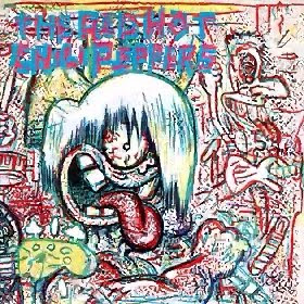
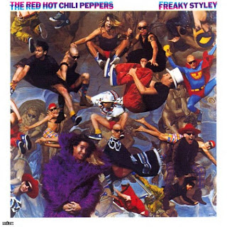
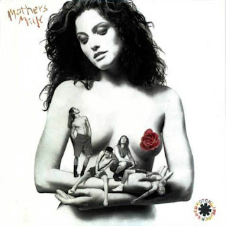
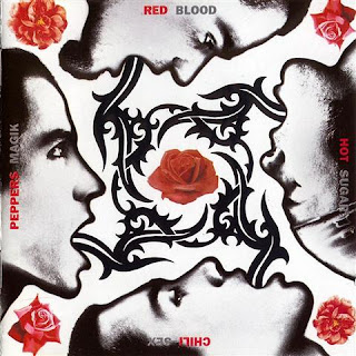
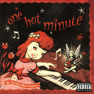

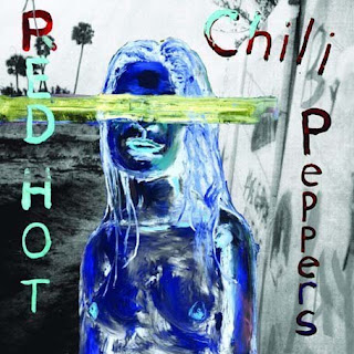

Looking through the album covers by the Red Hot Chili Peppers, you can see that they have changed from Rock and Roll to a bit more into the Pop genre. We thought about having the actors who played the Red Hot Chili Peppers in the music video on the cover but when we looked at past covers we realised that they only included the band on the front cover around 50% of the time, and since on the album that the song “Charlie” comes from didn’t have the band on it we decided to keep it that way and not add the band onto the cover. We discussed it and we all thought that the new album from The Red Hot Chili Peppers had a completely different look and feel to it. Since the song “Charlie” comes from their latest album “Stadium Arcadium” and the Stadium Arcadium album is based around a space theme we have come to a conclusion to carry on this theme onto the single CD cover for the song.
Friday, 12 November 2010
Finished Filming
We have finished filming and have already started work on the cd cover and on editing the music video. Once the album cover has been completed then we will start work on the magazine. The cd cover idea will be based on the music video plan where it will contain the monkey. We might have to change the idea a bit for the music videos we had to change the location for the performance part of the music video as it has now become unavaliable after our first booked slot had become canceled. We might still be able to use the drama studio if we are able to pull some strings and get it avaliable. But for now we have done some back up recording on a green screen so that we can change the background and add certain effects to it as we wish. The plan for the next week or so is to get the editing of the music video complete and to get the magazine and cd cover finished as well as maybe designing a small A5 poster. As well as this the storyboard is underneath as we have just been able to upload it:


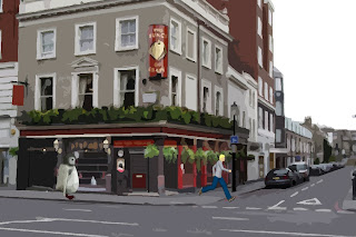
*Note: The Penguin represents the monkey
The rest of the storyboard is mainly based around performance, so the storyboard software was deemed useless for the rest of it. Once this storyboard, which was done on paper, is scanned onto the computer - then we will upload that. However, at the moment we're currently focusing on the editing, and our using the storyboard and making slight adjustments as we continue.
Thursday, 11 November 2010
The 1990s - The Album Cover Change
In 1992 veteran album sleeve designer Bill Claxton declared that "the art of the LP cover, I'm afraid, has pretty much vanished with the arrival of the compact disc product... I long for that big 12" by 12" space where an exciting visual image could be put that would do justice to the artist on the recording and 'turn on' the potential buyer." Such pessimism about the end of album sleeve design was defied by 1990s CD designers. Instead of mourning, many set about substantially changing the rules of album packaging, reducing the emphasis on a single killer image for the front cover, and instead of turning the CD booklet into an extended visual essay paralleling the CD's musical contents. As Stefan Sagmeister, one of the 90s most notable album sleeve designers, has said of CD packaging: "apart from displaying lyrics and liner notes, they should make the consumer feel good about the band. A typical CD cover holds more information than its vinyl counterpart. While album covers are almost like posters, CD covers are more like book design. Twenty-page booklets, transparent trays with concealed graphics underneath the CD, and elaborate printing are seen many general releases". Sagmesiter is notable for the extended visual essay and themed linking of disparate images. Other examples of this trend are the extended montage by Foul End Trauma for Orbital's In Sides (1996) and Blue Source's memorable pull-out of Tori Amos in a sub-Cindy Sherman series of adopted personas for Strange Little Girl (1997). French designer Philippe Savoir is another notable example, defining the look of the Orchestre National de Jazz by ensuring a consistent design approach to all of their CD's since 1995.
Tuesday, 9 November 2010
The Change to Album Covers
Having now researched the theory behind album covers, we decided it would be best to look at previous covers. Whilst there is a huge database on the internet of album covers, and sites which explain the process behind them - we decided that using a book would be far more quicker and efficient. Luckily, we found a book called: Album: Style and Image in Sleeve Design, which gave us all the information we'd ever need!
A copy of the book can be found here: http://www.amazon.co.uk/Album-Style-Image-Sleeve-Design/dp/1840006056
Whilst originally music was mainly advertised through billboards and/or posters, as shown within the book it changed drastically.
This shows a drastic change in American opinion to music. Despite being involved in World War II, America was still becoming increasingly popular in terms of record sales and music popularity, despite suffering from an early Great Depression and a war. Furthermore, even though war and poverty was surrounding the country, the majority of people still lived in hope. Propaganda throughout America was developed to encourage positive feelings towards the war effort - and the economy as a whole. Perhaps, this could be argued to explain why music became so popular. Whilst the rest of the World remained depressed, American society stood out and lived in hope. Music, as a whole, is an uplifting and cheerful piece of art so perhaps people brought the music in hope of remaining positive in such tough times. This would explain why the majority of album covers throughout the 1940s either have artwork of American soldiers (as shown in New Orleans Jazz - KID ORY, Columbia, 1947), or imagery of the artist expressing hope and happiness (Favorite Hawaiian Songs, BING CROSBY, Decca, 1944). This idea of hope would relate particularly to the traditional role of the American Dream, whereby the majority of American settlers migrated in desperation of a new change; a new beginning for wealth, prosperity, and escape from religious persecution.
A copy of the book can be found here: http://www.amazon.co.uk/Album-Style-Image-Sleeve-Design/dp/1840006056
Whilst originally music was mainly advertised through billboards and/or posters, as shown within the book it changed drastically.
While record sales in Europe were badly affected by World War II, in America they were on a steadily upward trend, both during the War and in the boom that followed its end. Between 1944 and 1946 sales tripled from $66 million to $200 million per annum, and that was despite disruptions caused by material shortages, disputes over copyright fees for composers, and strikes in aid of unemployed musicians put out of work by the talking movies.
This shows a drastic change in American opinion to music. Despite being involved in World War II, America was still becoming increasingly popular in terms of record sales and music popularity, despite suffering from an early Great Depression and a war. Furthermore, even though war and poverty was surrounding the country, the majority of people still lived in hope. Propaganda throughout America was developed to encourage positive feelings towards the war effort - and the economy as a whole. Perhaps, this could be argued to explain why music became so popular. Whilst the rest of the World remained depressed, American society stood out and lived in hope. Music, as a whole, is an uplifting and cheerful piece of art so perhaps people brought the music in hope of remaining positive in such tough times. This would explain why the majority of album covers throughout the 1940s either have artwork of American soldiers (as shown in New Orleans Jazz - KID ORY, Columbia, 1947), or imagery of the artist expressing hope and happiness (Favorite Hawaiian Songs, BING CROSBY, Decca, 1944). This idea of hope would relate particularly to the traditional role of the American Dream, whereby the majority of American settlers migrated in desperation of a new change; a new beginning for wealth, prosperity, and escape from religious persecution.
History of Album Covers
An album cover is the front of the packaging of a commercially-released audio recording product, or album. The term can refer to either the printed cardboard covers typically used to package sets of 10" and 12" 78 rpm records, single and sets of 12" LPs, sets of 45 rpm records (either in several connected sleeves or a box), or the front-facing panel of a CD package, and, increasingly, the primary image accompanying a digital download of the album, or of its individual tracks.
The cover serves three main purposes:
1) To advertise and identify the contents of the music product.
2) To convey the artistic aspirations of the original artists (see Cover art and Alex Steinweiss).
3) In reproductions of the artwork, to serve as a primary image in the promotional efforts surrounding the product, as an identifiable image associated with it.
In addition, in the case of all types of records, it also serves as part of the protective sleeve.
Source:http://en.wikipedia.org/wiki/Album_cover
There is also plenty more detail and information into the theoretical and business plan behind an album cover. It also develops and describes the importance of aesthetics to the cover, whereby it is crucial to target a certain audience and attract as many people as possible.
Another important note would be:
With the increasing popularity of digital music downloading service and the inflating cost of conducting business, the purpose and prevalence of the album cover is evolving. While the music industry tries to keep up with technological and cultural shifts, the role that packaging (and thus the "album cover") will play in consumer music sales in the near future is uncertain, although its role is certainly changing, and digital forms of packaging will continue to surface, which, to some degree (and to some consumers) take the place of physical packaging. However, As of 2008 should be noted that physical music products, with a physical "album cover", continue to outsell digital downloads by a substantial margin.[5]
In August 2008, album cover designer Peter Saville, responsible for cover art on albums by New Order and Roxy Music, suggested that the album cover was dead.[6]
One digital solution is the iTunes LP format for interactive album artwork introduced by Apple on the 9 September 2009.
Source: http://en.wikipedia.org/wiki/Album_cover#The_album_cover_in_the_age_of_downloads
This shows how despite technology has progressed, the need and desire for people to have music and the art in their hand is still very important for most. Whilst admittedly software, as mentioned, such as iTunes is becoming increasing popular - it still isn't enough to disrupt the demand for a personal, and physical copy.
Album Cover Research
Your cover is your calling card to the record industry and to the consumer...how well you design it and the other graphics for your release could well determine your success or failure as a musician.
Now that I have your attention, I have put together the following guidelines to help you realize the importance of the graphic design stage in preparing your music for the marketplace. A well designed and attractive cover, along with other detailed information you have included in the packaging, may well determine if the gatekeepers in the music business ever bother to listen to the music contained on the record, and if a music consumer is turned off or on by your graphics. It is the best advertisement for your music.
So, go through the following questions and evaluate the design, graphic images, text (title, credits, etc.) and concept of your release by answering the following questions thoroughly and carefully. Then critique your cover in a professional manner, suggesting any improvements you think would help make the graphic design a more effective introduction of your music to the industry and your fan/customers.
Source: http://www.musicbizacademy.com/knab/articles/cdcover.htm
Subscribe to:
Comments (Atom)


